
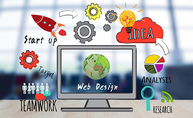
Advanced Responsive Web Design Course Training Center in Uttara, Dhaka
If you want to make your website more visually appealing and user-friendly, you need to consider web design and content arrangemen. For creating a web design, web hosting, web builder, point of sale, and other digital management are needed. Our ‘Outsourcing Training ‘is providing you with our advanced responsive web design course.
Responsive web design (RWD) is a web design approach that makes web pages render well on a variety of devices, from desktop computers to smartphones. RWD websites are designed to be flexible and adaptable so they can look good and function well on any screen size.
Course Schedule
Duration
90 Days
Classes
35 Classes
Fees
BDT-20000/=
Why is Advanced Responsive Web Design Important?
Responsive websites are essential for businesses in today’s digital world.. More and more people are using their smartphones and tablets to access the internet, so it is essential to have a website that looks good and functions well on all devices.
What Will You Learn in Our Advanced Responsive Web Design Course?
In our Advanced Responsive Web Design Course, you will learn everything you need to know to create responsive websites that are not only visually appealing but also user-friendly and performant. The following topics will be covered:
- The principles of responsive web design
- How to use CSS media queries to create responsive layouts
- How to use CSS Flexbox and Grid to create complex responsive designs
- How to optimize responsive websites for performance
- Best practices for responsive web design
Benefits of Taking Our Advanced Responsive Web Design Course
There are many benefits to taking our Advanced Responsive Web Design Course. Here are just a few:
Learn from experienced and qualified instructors: Our instructors are experienced web developers who are passionate about responsive web design. They will teach you the latest and greatest RWD techniques and help you develop the skills you need to create responsive websites that meet the needs of your clients.
Get hands-on experience with responsive web design projects: In our advanced responsive web design course, you will have the opportunity to work on real-world RWD projects. This will give you a chance to apply the skills you have learned and to build a portfolio of your work.
Gain the skills you need to create advanced responsive websites: Our course will teach you the skills you need to create responsive websites that are visually appealing, user-friendly, and performant. You will also learn about best practices for RWD.
Improve your job prospects in the web development field: RWD is a highly sought-after skill in the web development field. By taking our advanced responsive web design course, you will improve your job prospects and make yourself more marketable to potential employers.

Who Should Take Our Advanced Responsive Web Design Course?
Our advanced responsive web design course is ideal for web developers who want to learn the latest and greatest RWD techniques. It is also a good choice for web designers who want to create responsive websites and students who are interested in a career in web development.
Finally thought About Advanced Responsive Web Design Course
Advanced responsive web design is a skill that is in high demand in the web development industry. By taking our advanced responsive web design course, you will learn the skills you need to create responsive websites that are visually appealing, user-friendly, and performant. You will also learn about best practices for RWD.
A responsive website is essential for any business in today’s digital world. More and more people are using their smartphones and tablets to access the internet, so it is essential to have a website that looks good and functions well on all devices.
If you are serious about a career in web development, then taking our advanced responsive web design course is a wise investment. It will give you the skills you need to create responsive websites that meet the needs of your clients and stand out from the competition.
Our Advanced Responsive Web Design Course Modules
Introduction Responsive Web Design
- Overview of responsive design principles.
- The importance of mobile-first design
Advanced HTML and CSS Techniques
- HTML5 and CSS3 features.
- Media queries for responsive layouts.
- Flexbox and Grid layout for advanced structuring
JavaScript for Responsive Interactions
- Using JavaScript to enhance responsiveness.
- Event handling for touch and mouse interactions.
- DOM manipulation for responsive elements
Responsive Typography
- Typography best practices for different screen sizes.
- Web fonts and icon fonts.
- Fluid typography techniques.
Responsive Images and Media
- Techniques for optimizing images for various devices.
- Responsive image tags (srcset, sizes).
- Video and audio handling in responsive design
CSS Preprocessors and Build Tools
- Working with SASS or LESS for efficient CSS development.
- Task runners like Gulp or Grunt for automation.
Responsive Navigation and Menus
- Creating responsive navigation bars.
- Dropdown menus and off-canvas menus.
- Accessibility considerations
Advanced Layout Patterns
- Creating complex layouts with responsive design.
- Multi-column layouts.
- Sticky headers and footers
Performance Optimization
- Strategies for improving website loading times.
- Lazy loading and optimizing assets.
- Mobile optimization techniques.
Testing and Debugging:
- Cross-browser and cross-device testing.
- Debugging responsive design issues.
- Testing tools and emulators.
Frameworks and Responsive Design
- Using CSS frameworks like Bootstrap or Foundation.
- Customizing frameworks for responsive projects
Web Design Trends and Future Considerations
- Staying current with web design trends.
- Preparing for emerging technologies (e.g., foldable screens)
Responsive Web Design Projects
- Practical projects to apply the concepts learned.
- Building responsive websites and web applications
User Experience (UX) and Accessibility:
- Designing for a seamless user experience across devices.
- Ensuring web accessibility for all users
Final Project and Portfolio Development
- Developing a responsive web design portfolio piece.
- Showcasing your skills and knowledge
Course Modules
- HTML5
- Design To HTML
- JavaScript
- Bootstrap Latest Version
- CSS3
- CSS3 Animation Effect
- JQuery
- Marketplace-Related Classes
Learning Software


Admission going on
Admission Now Open for All Courses! Don’t miss the opportunity to enhance your skills in digital marketing, graphic design and web design & development . Enroll today to secure your spot and embark on a rewarding journey of learning and professional growth.
Responsive web design (RWD) is a web design approach that makes web pages render well on a variety of devices, from desktop computers to smartphones. RWD websites are designed to be flexible and adaptable, so they can look good and function well on any screen size.
RWD is important because more and more people are using their smartphones and tablets to access the internet. Mobile devices now generate over half of all web traffic.. If your website is not responsive, it will look bad and be difficult to use on mobile devices, which could result in lost visitors and customers.
Responsive web design (RWD) is a web design approach that makes web pages render well on a variety of devices, from desktop computers to smartphones. RWD websites are designed to be flexible and adaptable, so they can look good and function well on any screen size.
Benefits of responsive web design:
- Improved user experience
- Increased traffic and conversions
- Reduced maintenance costs
- Increased reach and engagement
The main goal of responsive design is to create a website that looks good and functions well on all devices, regardless of screen size or orientation. Mobile devices are now essential for accessing the internet, with over half of all web traffic coming from smartphones and tablets. This is why it is more important than ever for businesses to have a responsive website.
Responsive design is achieved by using a variety of techniques, including fluid layouts, media queries, and responsive images. Fluid layouts use relative units, such as percentages and ems, instead of fixed units, such as pixels. This allows the layout of the website to expand and contract to fit different screen sizes.With media queries, you can change CSS styles based on screen size.. For example, you could use a media query to specify a different font size for mobile devices than for desktop computers. Responsive images are images that have multiple versions of themselves with different sizes and resolutions. This allows the browser to choose the best version of the image to display based on the screen size of the device.
Responsive design techniques are a set of methods and approaches used to create websites that can adapt to different screen sizes and devices. Mobile devices are now the primary way for people to access the internet, so it is important to have a responsive website.
Here are some of the most common responsive design techniques:
Fluid layouts: Fluid layouts use relative units, such as percentages and ems, instead of fixed units, such as pixels. This allows the layout of the website to expand and contract to fit different screen sizes.
Media queries: Media queries are a CSS feature that allows you to apply different CSS styles depending on the screen size of the device For example, you could use a media query to specify a different font size for mobile devices than for desktop computers.
Responsive images: Responsive images are images that have multiple versions of themselves with different sizes and resolutions. This allows the browser to choose the best version of the image to display based on the screen size of the device.
Responsive web design is a web design approach that makes web pages render well on a variety of devices, from desktop computers to smartphones. RWD websites are designed to be flexible and adaptable, so they can look good and function well on any screen size.
Reactive web design is a web design approach that uses JavaScript to dynamically update web pages based on the user’s device and behavior. Reactive websites are often used to create interactive and real-time applications, such as social media websites and online games.
Here are the top 9 reasons to use responsive web design, shortly answered:
Improved user experience: Responsive websites are easier to use and navigate on all devices, providing a better user experience.
Increased traffic and conversions: Responsive websites are more likely to rank higher in search engine results pages (SERPs), which can lead to increased traffic and conversions.
Reduced maintenance costs: By having a single responsive website instead of multiple websites for different devices, you can reduce your maintenance costs.
Increased reach and engagement: Responsive websites allow you to reach and engage with a wider audience, including mobile users.
Future-proofing: Responsive websites are designed to adapt to future devices and technologies.
Competitive advantage: Responsive websites can give you a competitive advantage over businesses that do not have a mobile-friendly website.
Consistency: Responsive websites provide a consistent user experience across all devices, which can improve brand recognition and trust.
Analytics: Responsive websites make it easier to track and analyze user behavior across all devices.
Performance: Responsive websites can improve the loading times of your website, which is important for both user experience and SEO.
Here are some of the latest trends in responsive web design:
Minimalism: Responsive web designs are becoming increasingly minimalist, with a focus on clean lines, white space, and bold typography. This helps to create a more user-friendly experience on all devices.
Micro-interactions: Micro-interactions are small, animated elements that can be used to add interest and engagement to responsive web designs. For example, a button that changes color when hovered over is a micro-interaction.
Card-based layouts: Card-based layouts are a popular way to organize content on responsive web designs. They are easy to scan and read on all devices, and they can be used to create a variety of different layouts.
Hidden menus: Hidden menus are a way to keep navigation menus tidy and out of the way on small screens. They can be revealed when the user taps or clicks a button.
Infinite scrolling: Infinite scrolling is a way to keep users engaged on a web page by automatically loading more content as they scroll down.